
Outdated Infrastructure in Landscape (No. 3) by Kevin Fletcher
Outdated Infrastructure in Landscape (No. 3)
Kevin Fletcher
Outdated Infrastructure in Landscape (No. 3)
Kevin Fletcher
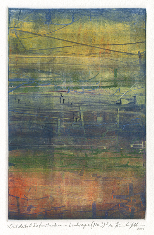
1956 - PRESENT (biography)Fletcher's artistic background is broad, with inspiration and technique stemming from his experimental, Atelier 17-trained professors to the classical, representational stylings of Old Masters. His most well-known prints are black and white abstractions suggestive of architectural ruins and dark, wintery landscapes, achieved through reductive methods; however he is also a classically trained painter. After many years of separating his reductive (relief print) and additive (painting) techniques, he decided to try to combine these modes on the matrix.
Said Fletcher of his latest work: "What I wanted in color prints was a painterly way - like with litho - adding layers of drawn color in gradual accumulation, or even rapid accretion if it suggested this in process. So, multiple over-printings like lithography - or, multiple roller pass on the same plexiglass to paint with the roller/brayer, feathering in and out, as needed. Moreover, I wanted to find a way to make a positive mark like a pencil - a colored pencil - like the litho crayon, which is printed from the stone (or plate). I reasoned that since I was already using a cardboard/matboard chip and [was] used to it, I should try that out somehow.
"It occurred to me that if I started from solvent, applied with a fine cotton cloth, I could cut through that sheen with a tip or corner of the chip - in the same way I had in my reductive work. This had always afforded calligraphic white lines in those dark B&W prints. If the chip would expose the plexiglass, why wouldn't an oil based ink TAKE to those exposed areas? Well, with the right oil added - it did.
"Then, the roller could be set up in the 'split fountain roll' - a blend, or further marks made, oil shifted and a different, darker pigment added, then rolled again. The only issue was 'lap marks' - roller circumference. But even that lap mark variation seemed to add an atmospheric interference. You can see how the open experimentation has played out. The vertical format means less obvious methodology.