
19th, 20th & 21st Century Fine Prints
707-546-7352 · fax 707-546-7924 · web: www.annexgalleries.com · email: artannex@aol.com
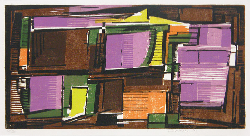
Contrasting Harmony by Werner Drewes
Contrasting Harmony
Werner Drewes


Contrasting Harmony
Werner Drewes
1899 - 1985 (biography)"Contrasting Harmony" is one of a series of abstract color woodcut compositions Drewes was working on in his early seventies. For this work he used nine colors (black, two browns, two purples, green, orange, and two yellows), printing it on ivory Japanese paper in an edition of 40 as well a 4 artist's proofs. The blocks have been destroyed. An impression of "Contrasting Harmony" is illustrated on page 147 of the Rose catalog rasionné.
As a printmaker, Bauhaus trained Werner Drewes worked using intaglio, lithography and relief methods using both black and white to brilliant color and his work ran the gamut from figurative to non-objective. He was able to interweave these throughout his career, as Peter Hahn stated in the catalogue raisonné of Drewes' work by Ingrid Rose:
"Regardless of the technique, whether woodcut, etching, aquatint, engraving or lithography, the basis for the images is technical expertise, indeed mastery. A surprisingly rich body of work exists between expression and abstraction, between construction and realism, a field of tension combining very different means of expression, in the center of which the human being is always apparent. It is an independent body of work which, based on the acquired technical and academic teaching of the Bauhaus."